When building a prior version of this very website, I’ve had issues making text size be consistent across elements on mobile Chrome. Elements had different text sizes on mobile even though the CSS had them as the same text size.
For example:

Before you go fixing it, consider whether you really need to. Text inflation is an accessibility feature. You could be fucking some people over.
Identify the problem
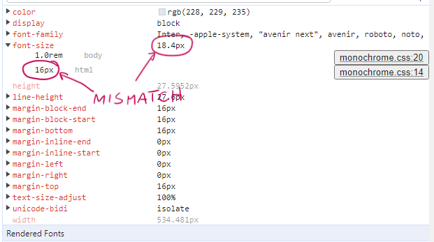
If you have text size mismatch issues like in the screenshot above, you may have this problem.
You can confirm by using Chrome Inspector on your phone’s browser, under the “Computed” tab:
To see this, you have to use USB debugging on your Android device to debug your Android’s Chrome browser. This behavior will not happen on desktop, even if you enable the mobile view.
You’re looking for a computed font size that’s larger than the specified font size, and there is nothing in the CSS to cause this. This is caused by the text inflation algorithm on mobile browsers.
Still not sure? On Chrome mobile, go to Settings → Accessibility and increase “Text scaling”.
Red herring: text-size-adjust
The following is usually documented as the correct fix for this problem. Add this to your html element:
html {
  /* Your other stuff here */
  text-size-adjust: none;
}
MDN docs claim the text-size-adjust tag fixes this in most browsers, including Chrome, with the following explanation:
Since text that has been scaled down to fit a mobile screen may be very small, many mobile browsers apply a text inflation algorithm to enlarge the text to make it more readable. When an element containing text uses 100% of the screen’s width, the algorithm increases its text size, but without modifying the layout. The
text-size-adjustproperty allows web authors to disable or modify this behavior, as web pages designed with small screens in mind do not need it.
This is incorrect, or rather incomplete.
This will fix some text size issues (for example, when the user selects “Desktop site” and the text becomes huge for no reason) but it will not fix problems with different elements having different sizes --- the browser will still apply text inflation.
You should still do this, but also do the below.
Actual solution: max-height
To disable text inflation, you need to add max-height to the element containing the text. Yes, this is the recommended “hack” that you see on the internet. Yes, it works.
I only want to disable it on headers and footers, so I have the following in my css:
.header-text, .footer-text {
  max-height: 1000000px;
}
(I actually have max-height: 500px because I know the header/footer won’t be larger than that but I know y’all and you’re just gonna copy paste it so I put a big number.)
Before (text is inflated):

After (text is the size I want):

Note: This won’t work if you specify the “max-height” high up the hierarchy (like in body, wwww, main, or similar). You have to specify it in the element that contains the text, not a parent. If you have a div with a bunch of p in it, max-height has to be in each p.
This is a hack, so if in 2 years you have an enormous paragraph that’s taller than a million px, you might wonder why your text is cut off.
That’s it!